What Actually Makes a Book or Catalogue Look Premium (It’s Rarely What You’d Guess)

Email Address
printfix2021@gmail.com
Phone Number
(+62) 816 524 689
Our Location
Mumbai 400033
printfix2021@gmail.com
(+62) 816 524 689
Mumbai 400033
Print-Fix
August 9, 2026
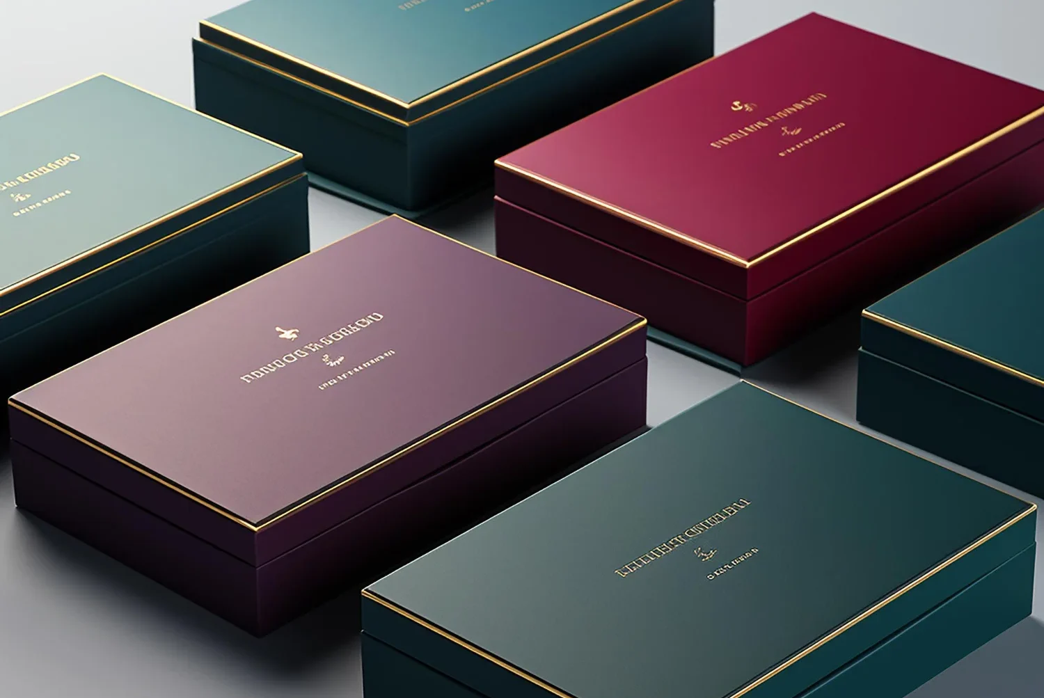
Most people assume print quality comes down to the printer. It doesn’t, not entirely. We’ve seen expensive presses produce forgettable brochures, and we’ve seen a well-chosen paper stock make a modest print run look like it came from a specialist publisher. The decisions that matter happen before the machine even starts.
GSM — grams per square meter — gets treated like a technical detail nobody needs to think about. It’s not. A 70–80 GSM matte paper feels completely different in your hands than a 250–300 GSM art card, and that difference changes how a reader perceives the content inside.
We’ve printed educational workbooks on heavier art card because students handle them daily and thinner stock wears out fast. We’ve used lighter matte paper for daily-practice books meant to feel unassuming rather than showy. The GSM choice isn’t cosmetic — it’s functional, and it should match how the reader actually uses the book.
Saddle stitch, perfect binding, hardbound case binding — each one sends a different signal before anyone reads a word. A saddle-stitched corporate brochure feels appropriately lightweight for something that’ll get skimmed once and filed away. A hardbound cookbook with case binding signals it’s meant to sit on a shelf and get reopened for years.
Here’s a mistake we see often: businesses choosing the cheapest binding option without considering how the document will actually be used. A technical reference manual that architects will flip through constantly needs binding that survives repeated use, not the binding that was fastest to quote.
Matte lamination with spot UV on a logo, gold foil stamping on a title, blind embossing on a geometric pattern — these finishing touches cost more, and they’re also exactly what separates a document that looks internally produced from one that looks professionally published.
We handled a corporate brochure recently that used a neutral beige-and-grey palette with soft-touch matte lamination throughout. Nothing loud, nothing flashy — but it read as considered in a way a glossy default finish wouldn’t have. That’s the difference finishing makes: it’s felt more than it’s noticed.
A proof copy looking great means very little if copy four hundred looks different. Color drift across a large print run is one of the most common — and most avoidable — quality failures in book and catalogue printing. It happens when quality checks only happen at the start and end of a job instead of throughout.
We run quality checks at each stage of production specifically because of this. A 500-page catalogue should read as consistently as the single sample you approved, not just resemble it loosely.
Check the paper weight against how the document will actually be handled. Match the binding to its expected lifespan and use. Don’t skip finishing details just because they add cost — they’re often what a reader notices first, even subconsciously. And ask your printer how they maintain consistency across a full run, not just the sample.
Working on a catalogue, workbook, or corporate publication? Share your page count, expected use case, and any reference material, and we’ll recommend the paper, binding, and finish that fits.
Get occasional updates on new capabilities, materials, and industry insights — no spam, unsubscribe anytime.